The small screen test
The first one, is the small screen test. This test is easy to do and I will tell you the result now.
From the following sites, only the Helenahoeve has a seperate design for small screens.
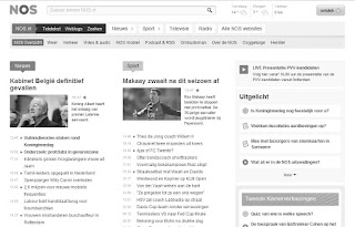
The grayscale test
How good are the designs when you don't see colors at all?
In my opinion, bol.com, ditzo.nl and eduhub.nl are too busy.
The blur test
Almost the same test, however now we use color, but there was a gaussian blur of 5 pixels. Lets see what it looks like.
Now only from bol.com, eduhub.nl and nos.nl it is clear which sitename is involved. The helenahoeve.nl and nos.nl seems to have the best readable test.
What else could I say about the designs. Personally I prefer the design of nos,nl and helenahoeve.nl
commandshift3.com has too few battles for these sites. I am curious about the opinion of the Dutch web users (so I have to wait for results of the Usability Award 2010 for this one).


No comments:
Post a Comment